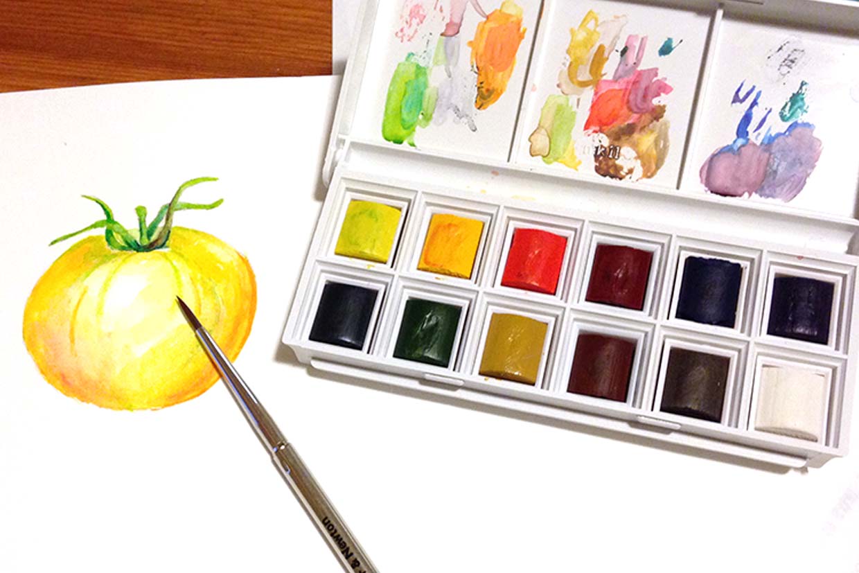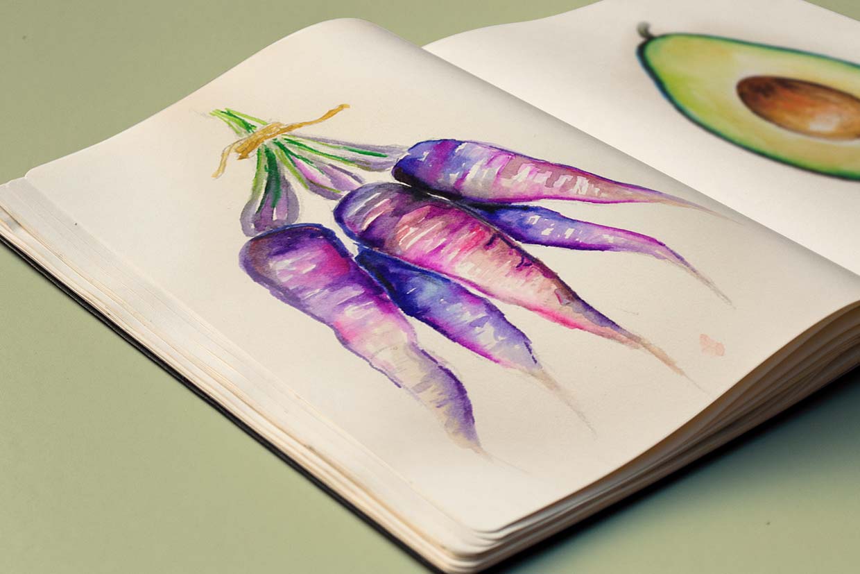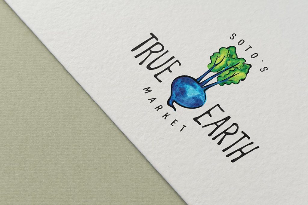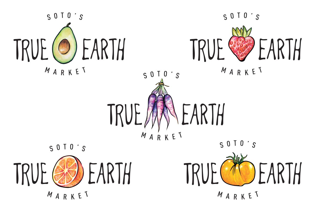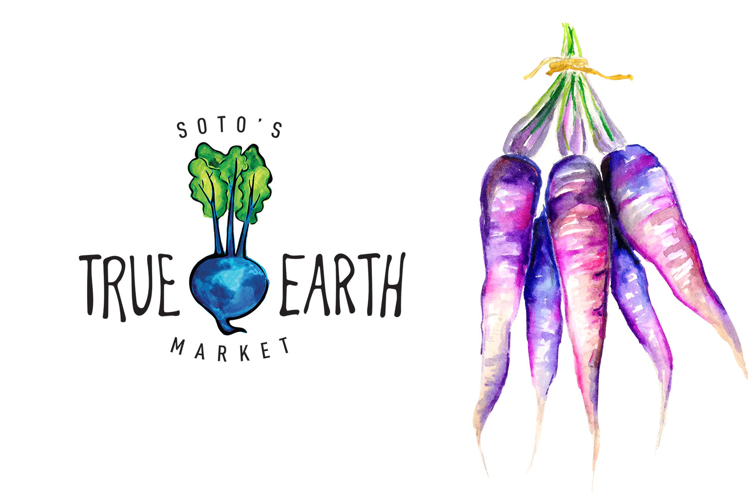
I really had fun creating this set of logos for Soto's True Earth Market in Cambria. I always like it when I get to mix art and design. This was one of those projects that worried me at first because I didn't know where to begin. But somehow my right brain always pulls through, even when my left brain doesn't understand HOW. I'm pretty pleased with the final result. What do you think?
Client:
Soto's True Earth Market
Brief:
To create a hand-drawn logo that incorporates a beet and an Earth, as well as a line of several other fruits and vegetables to be used interchangeably. These needed to be vector logos that could also be used for screen printing.
Style guide:
Click here to view the style guide

Scope of work:
· One main logo · Set of 5 related logo variations
